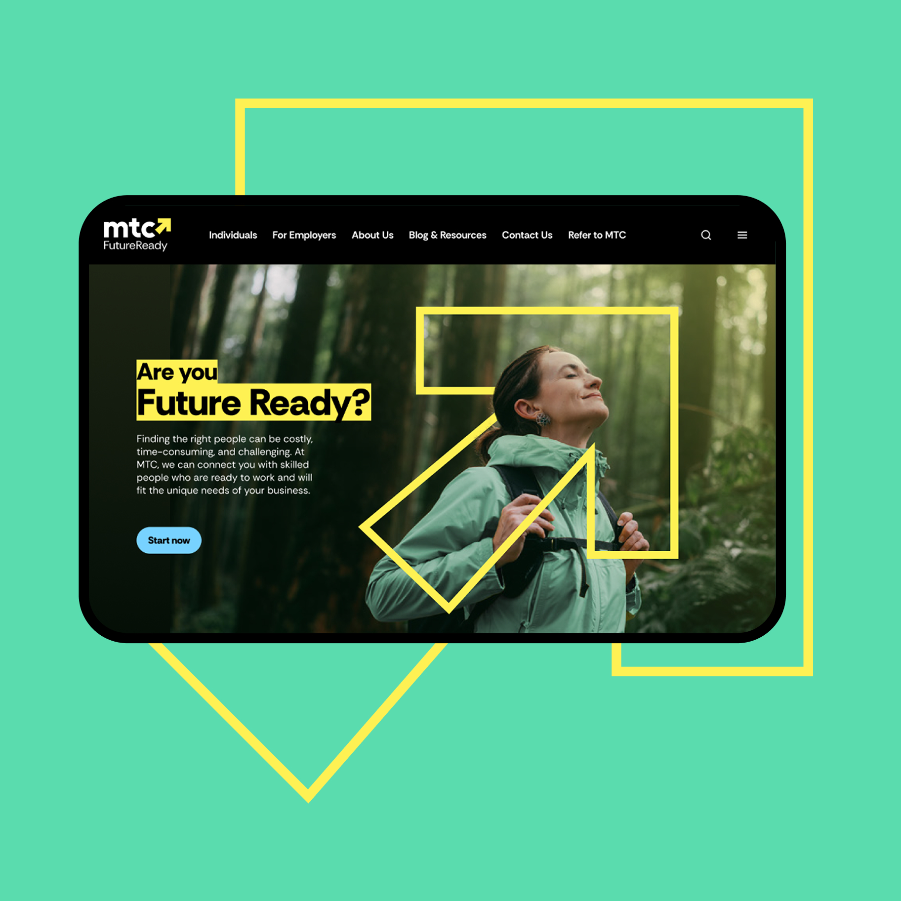
MTC had undergone a brand transformation, but its digital experience hadn't caught up. navigation was unclear, content was difficult to find, and inconsistencies across the legacy component library created confusion for both users and internal teams. without an internal UX function, there was a need to establish a clearer structure, reduce friction, and create a system that could be easily managed and scaled.
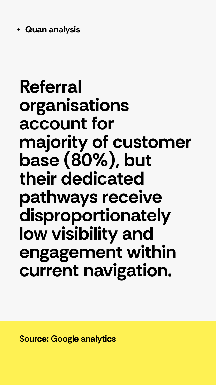
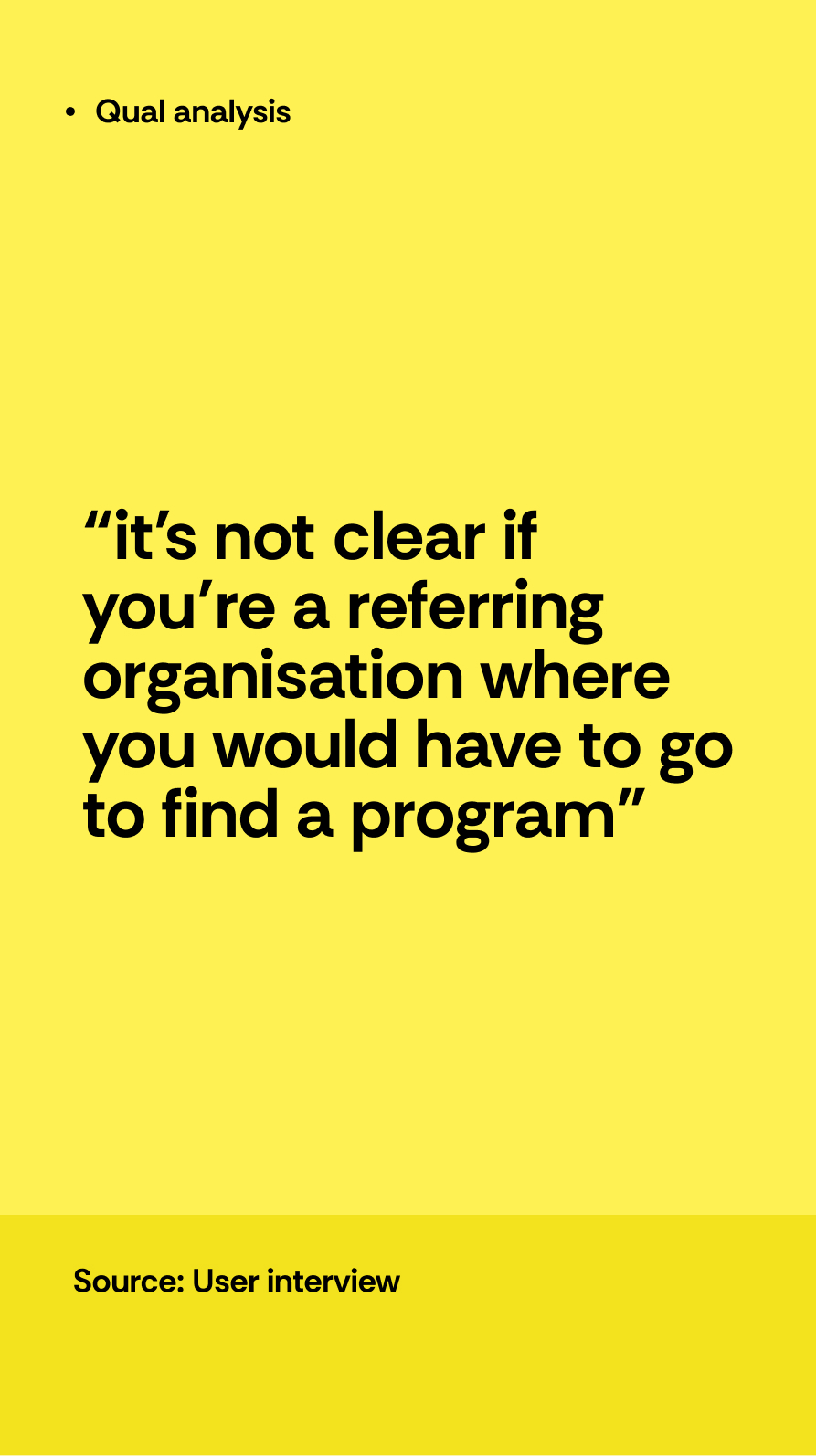
a research-led approach combining qualitative and quantitative insights to rethink the information architecture. stakeholder interviews surfaced key business challenges and gaps in how services were being communicated, while Google Analytics highlighted mismatches between user behaviour and navigation structure. this was validated through card sorting and tree testing with real users to refine labels and pathways.
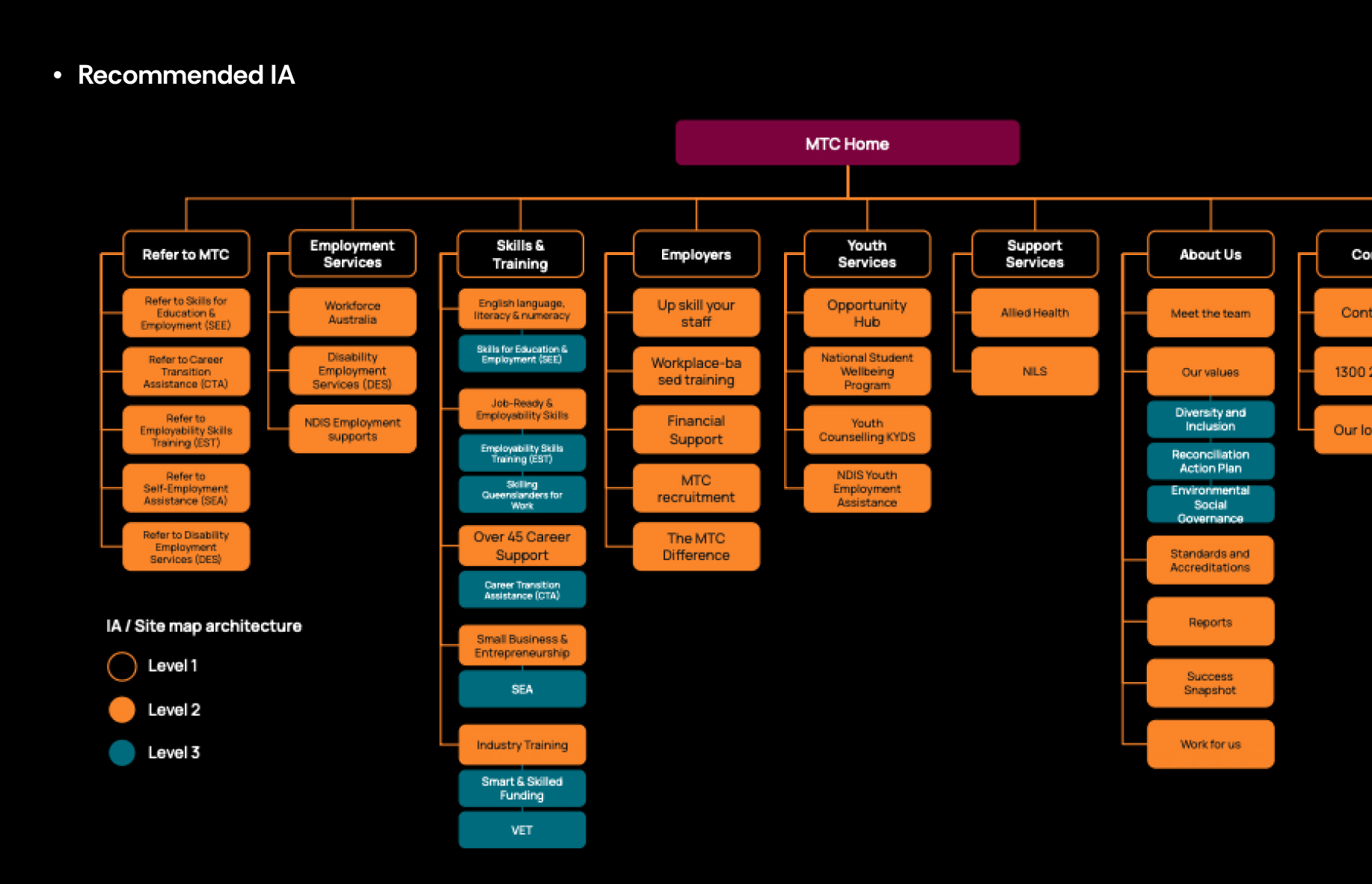
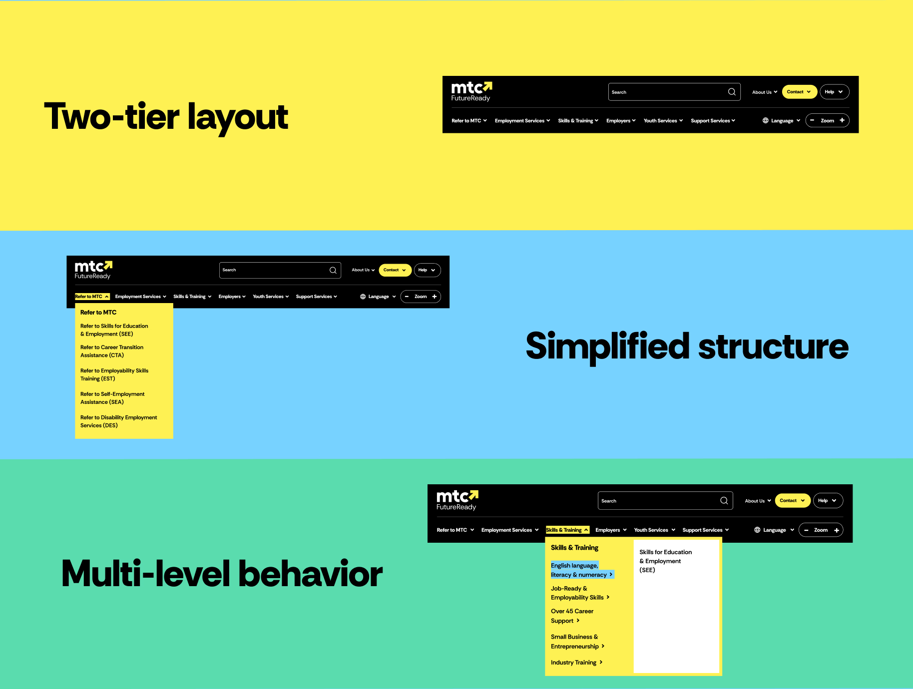
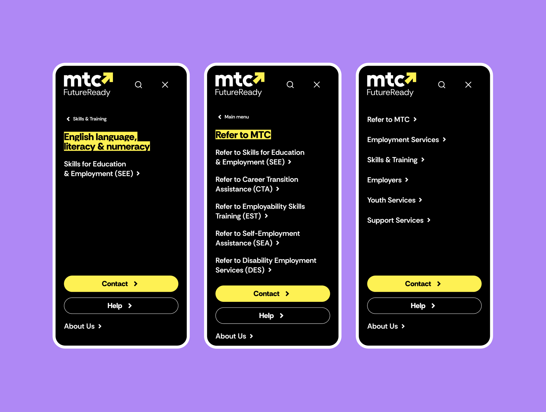
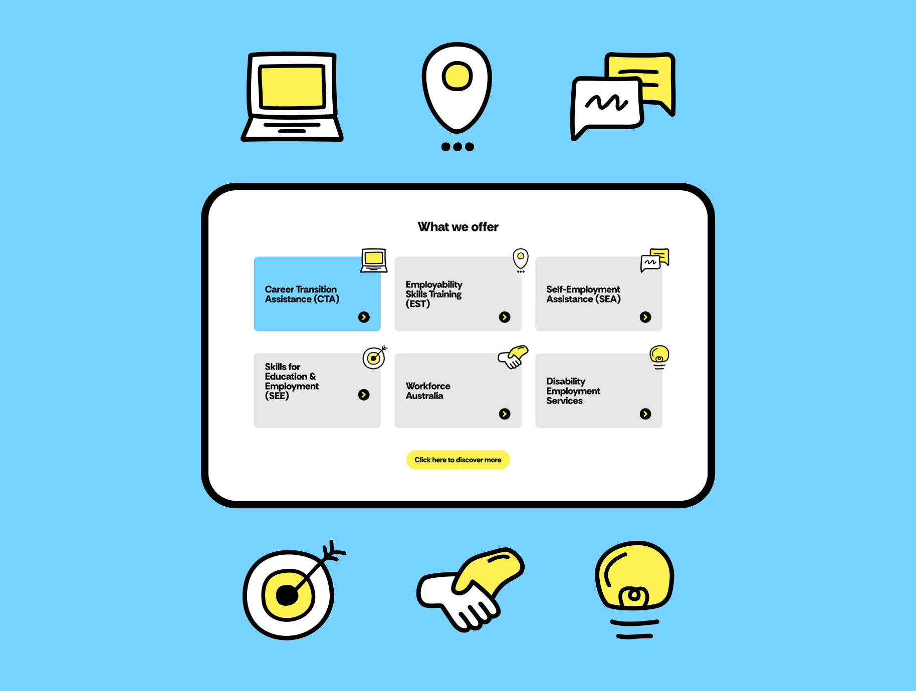
these insights informed a simplified, two-tier navigation and multi-level structure for improved clarity, and to surface high-value pathways.
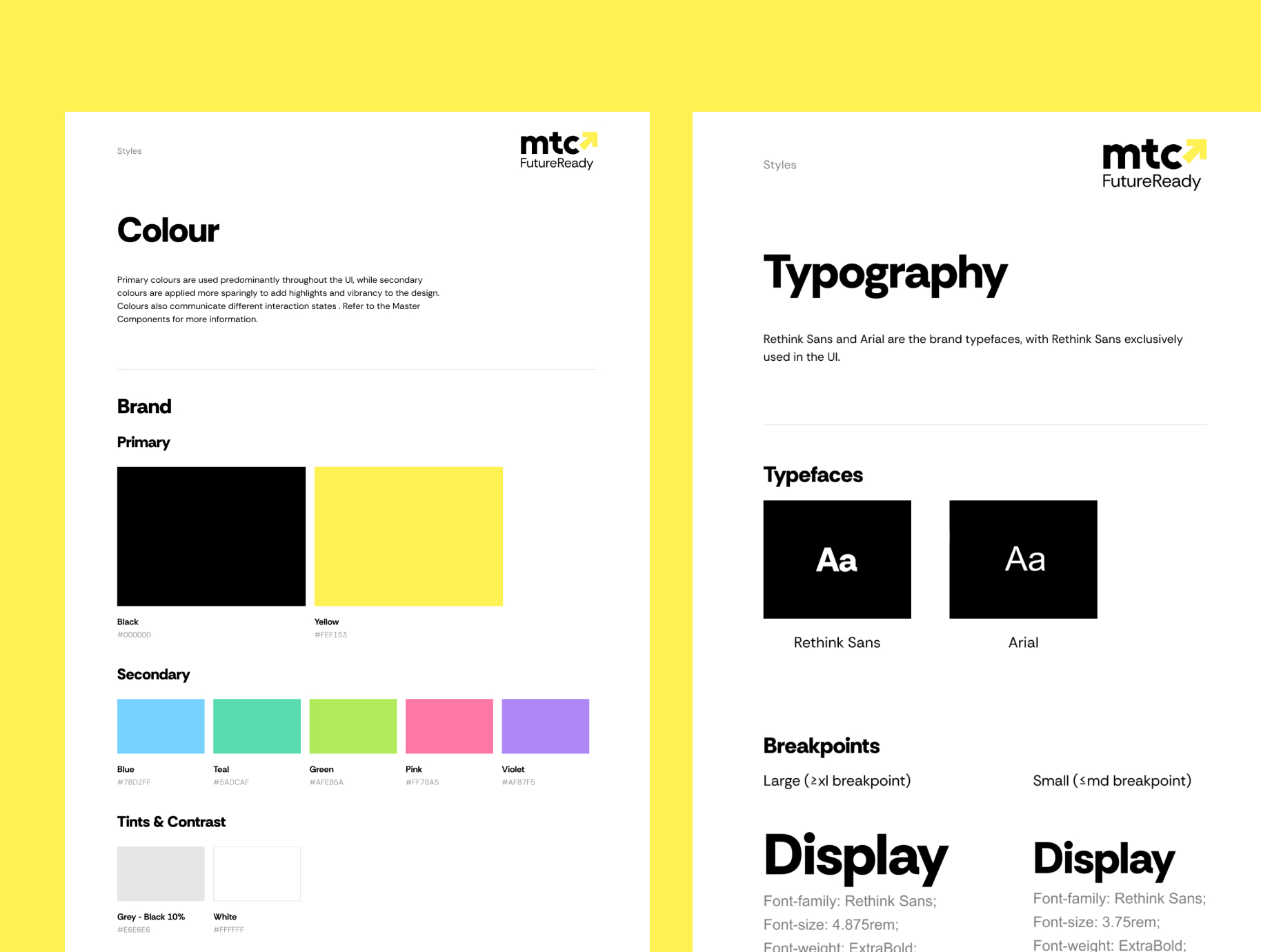
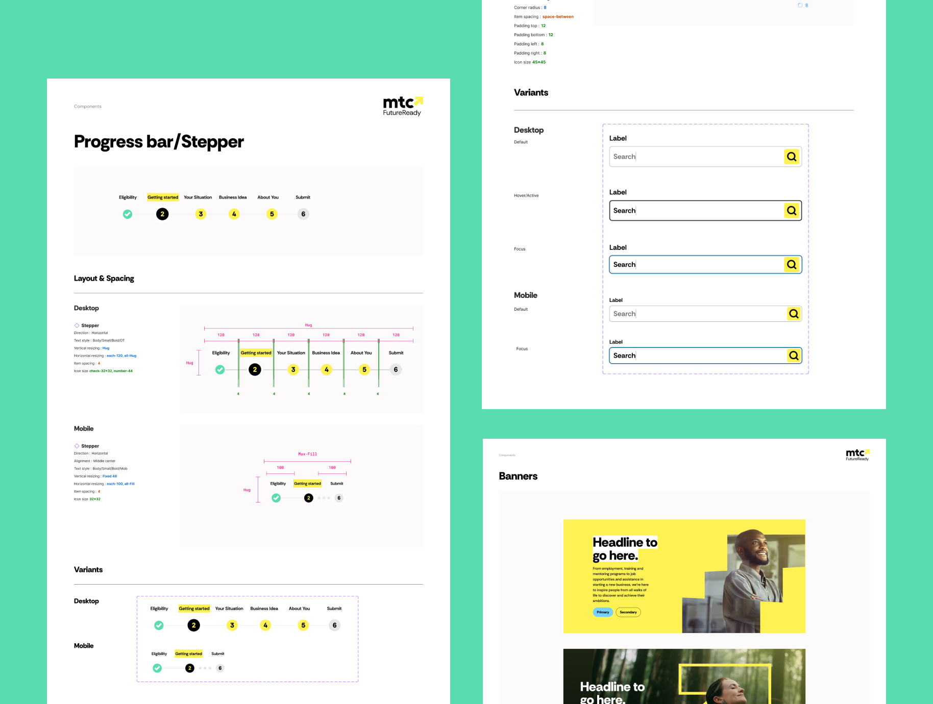
the result was a more intuitive and cohesive experience, with improved navigation and clearer pathways for users. a scalable library of 50+ components and reusable templates streamlined the build process, enabling faster rollout of pages while maintaining consistency across the site.
set up a flexible foundation that supports long-term growth, allowing the platform to evolve alongside the business without introducing design or technical debt. the system empowers internal teams to build and scale confidently, while maintaining a high standard of usability, accessibility, and brand consistency.