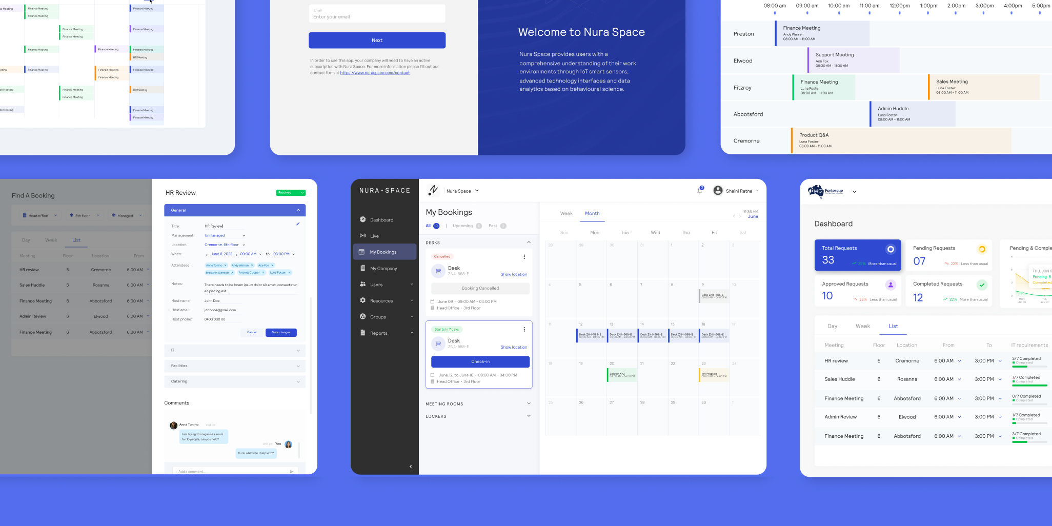
as a seed-stage product, nuraspace lacked a cohesive design system and consistent visual structure. the interface needed to evolve beyond early-stage decisions while still working within the constraints of the existing brand. there was also a need to bring more clarity and order to the product as new features and use cases continued to emerge.
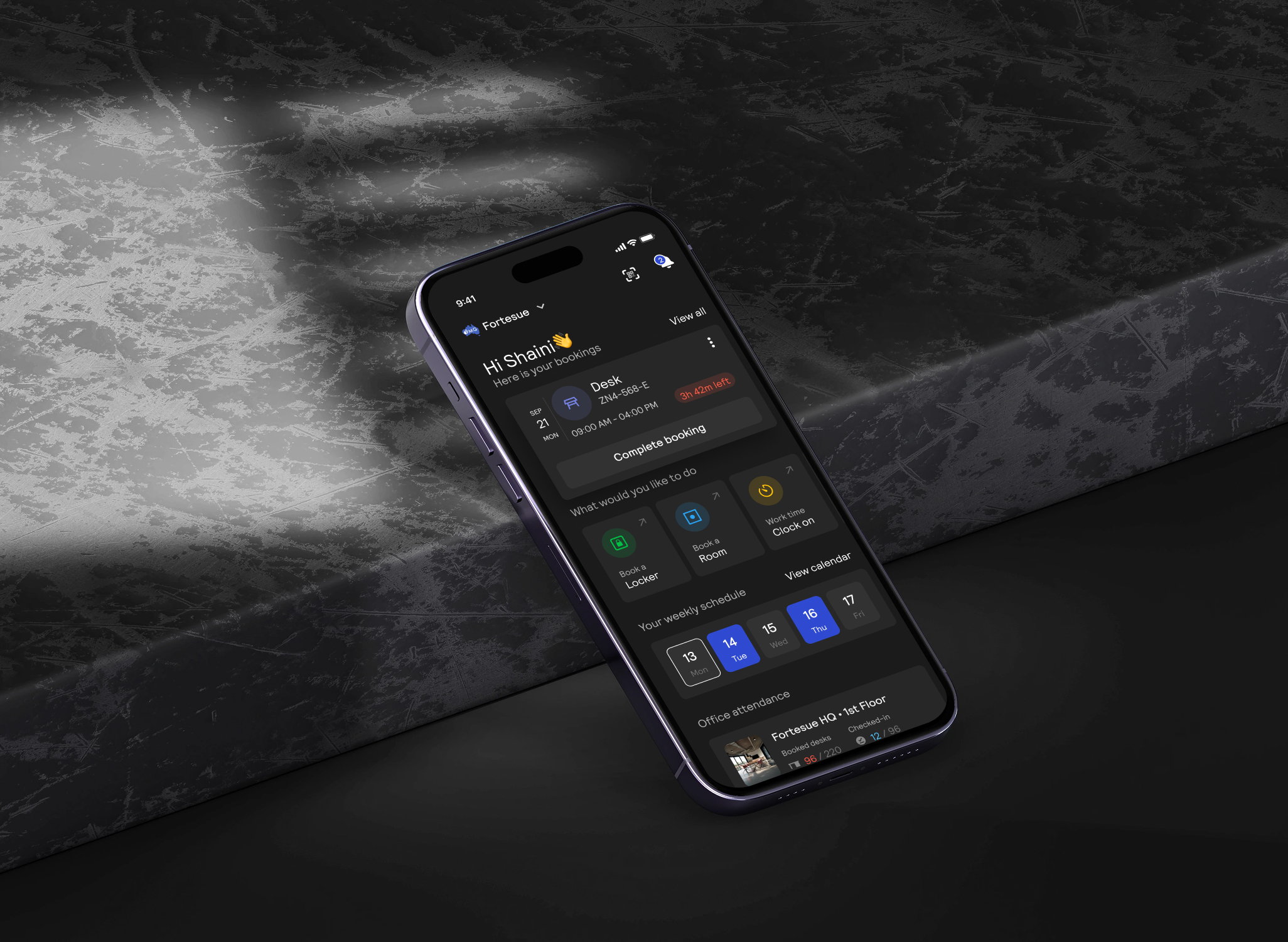
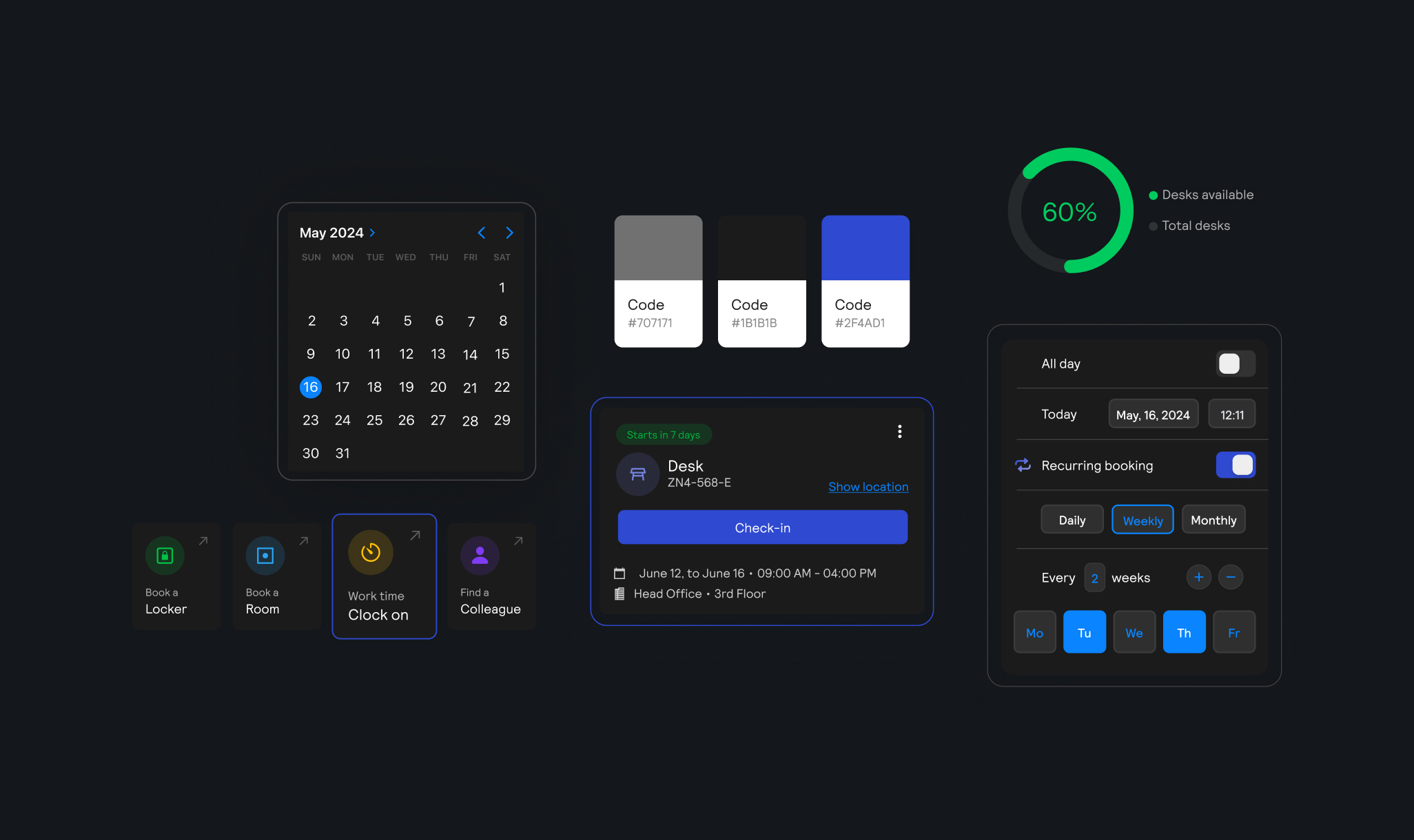
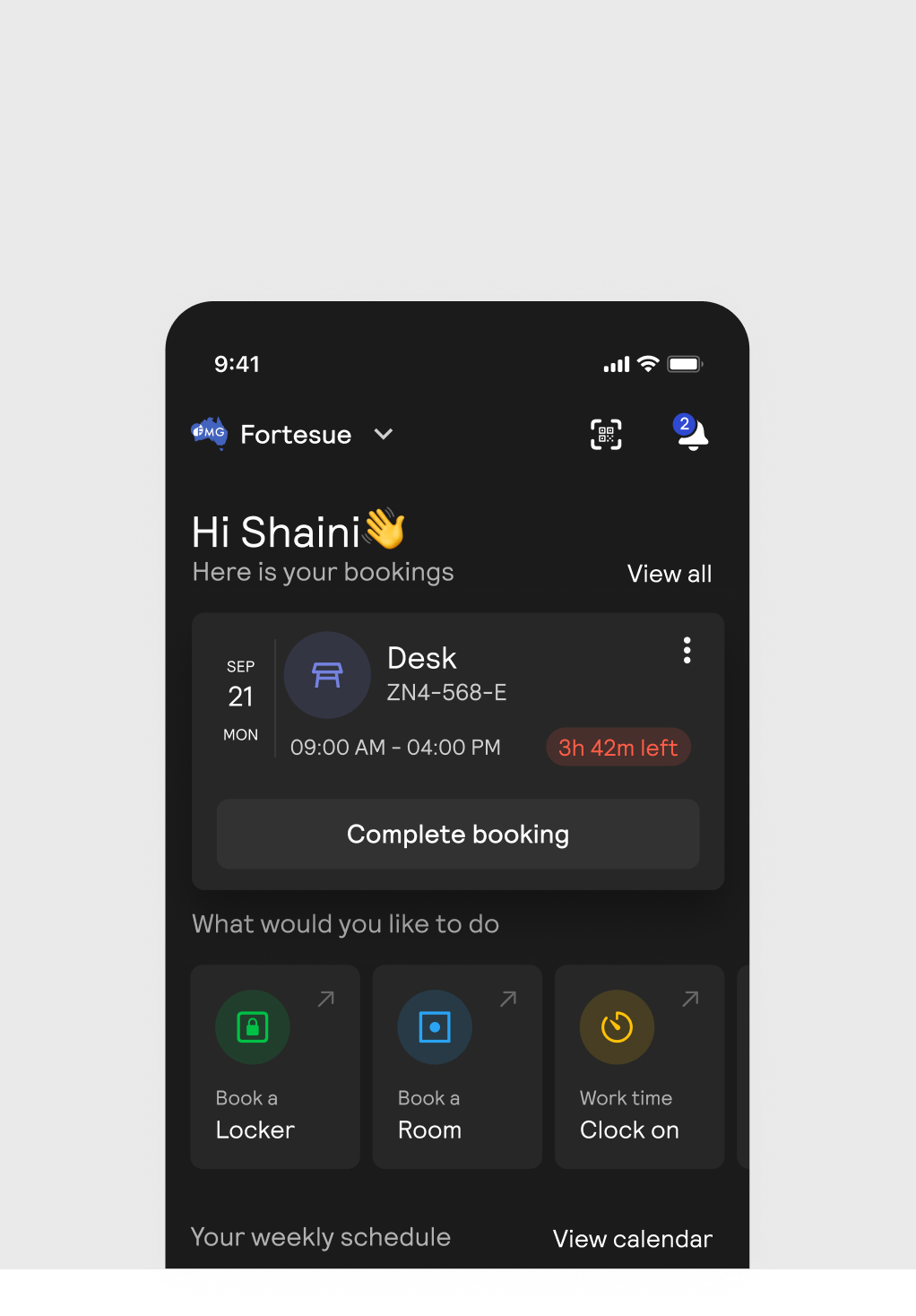
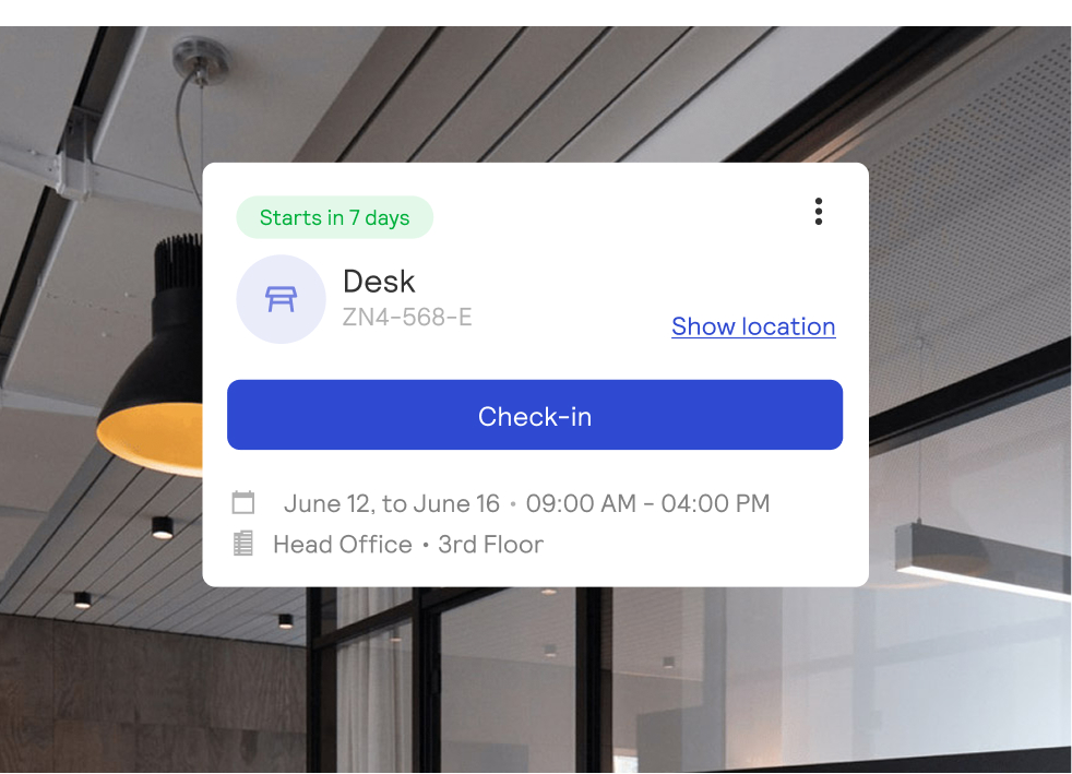
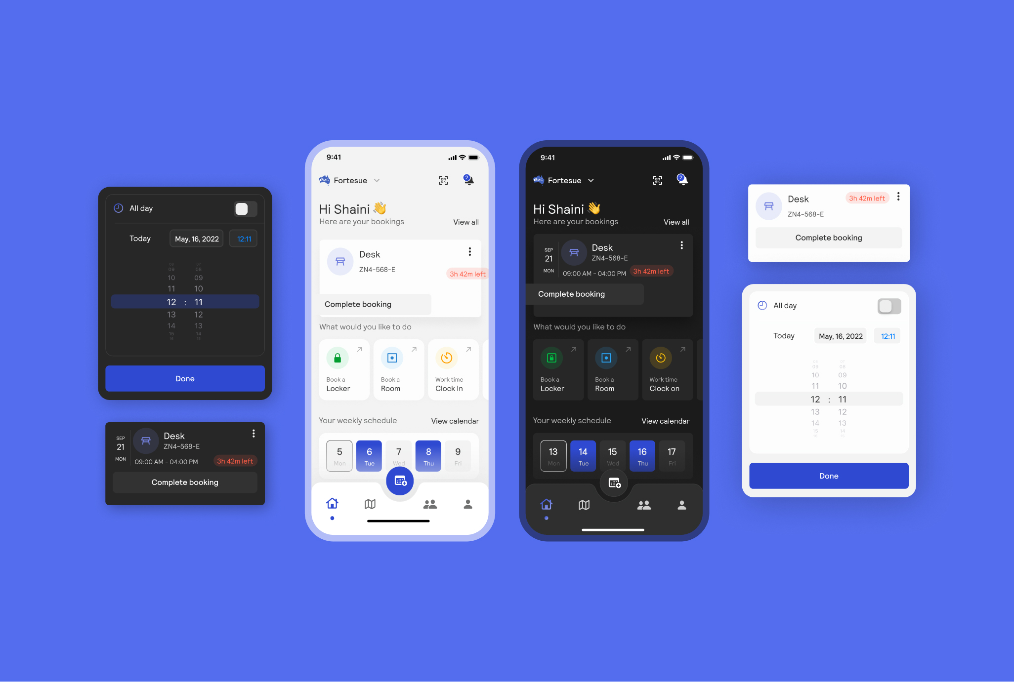
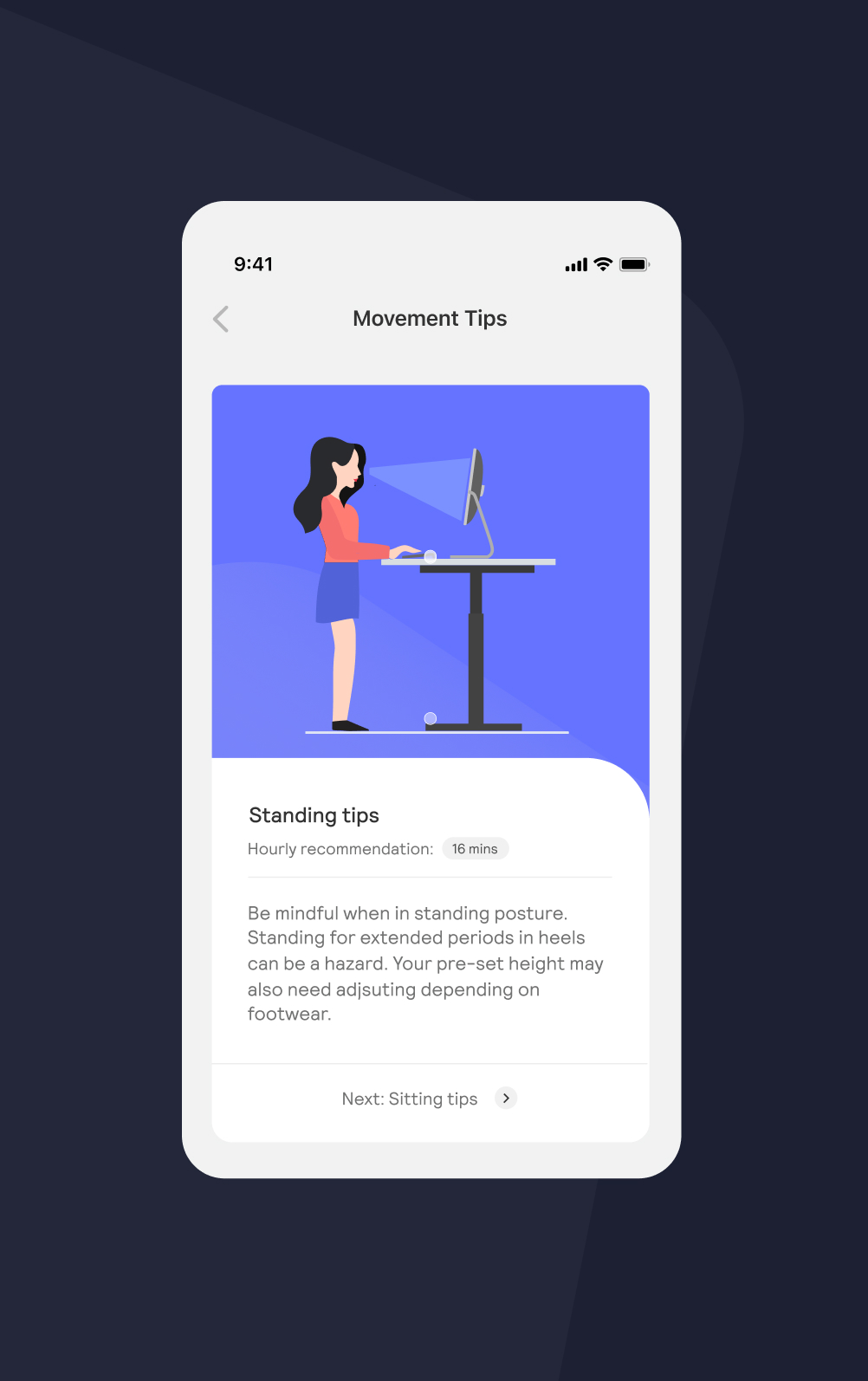
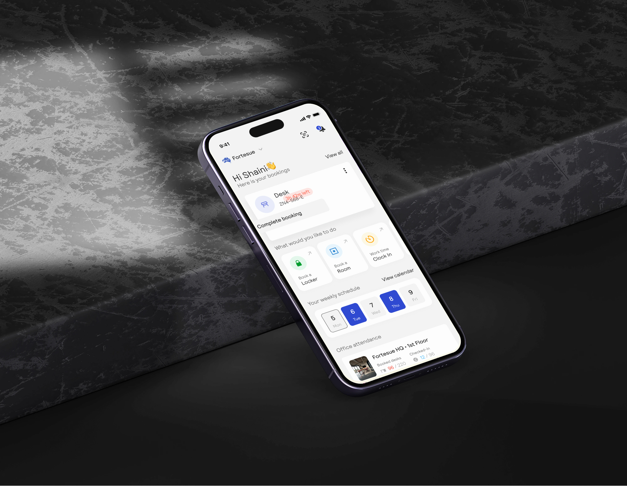
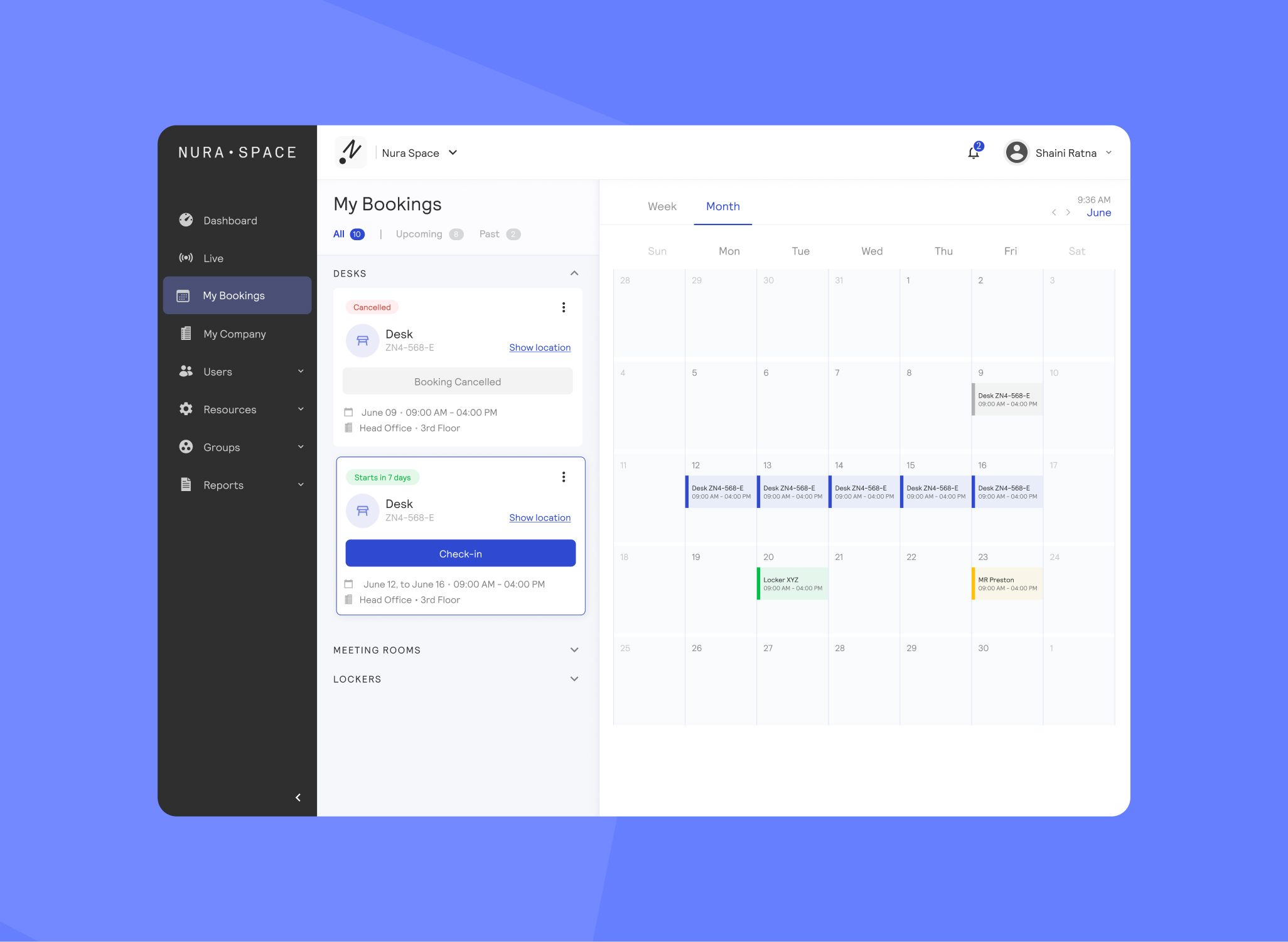
led the UI and design system direction by building on the existing visual identity — refining patterns, introducing consistency, and establishing a more structured system in Figma. focused on creating reusable components and clearer guidelines to support both current needs and future expansion.
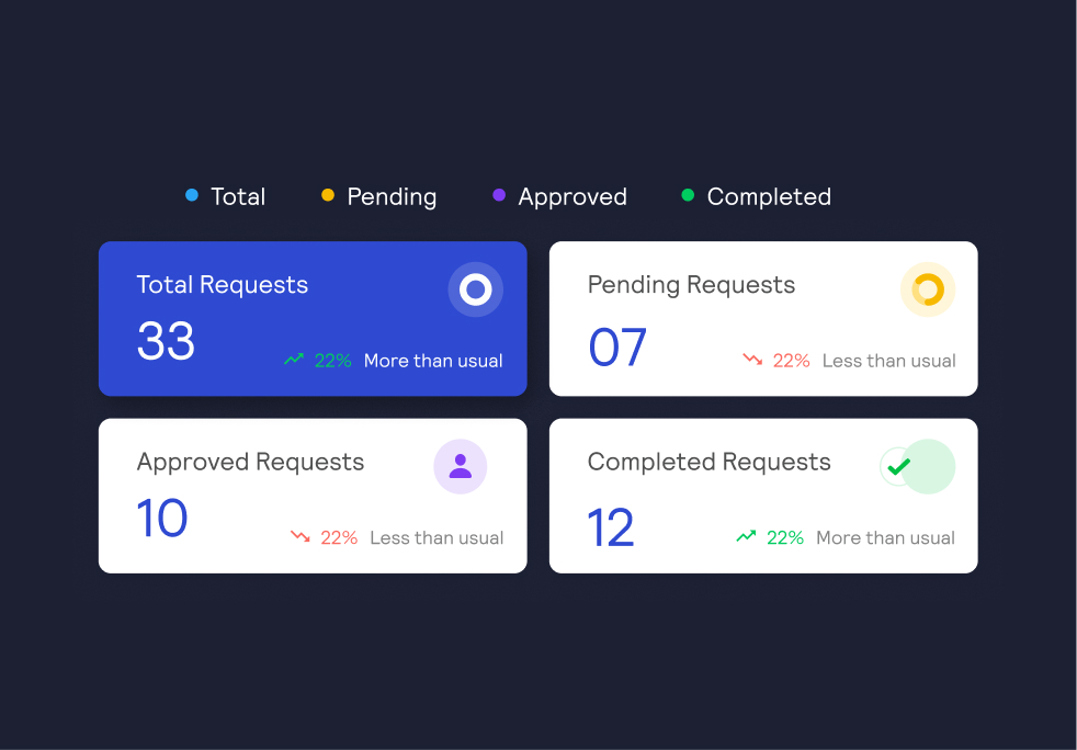
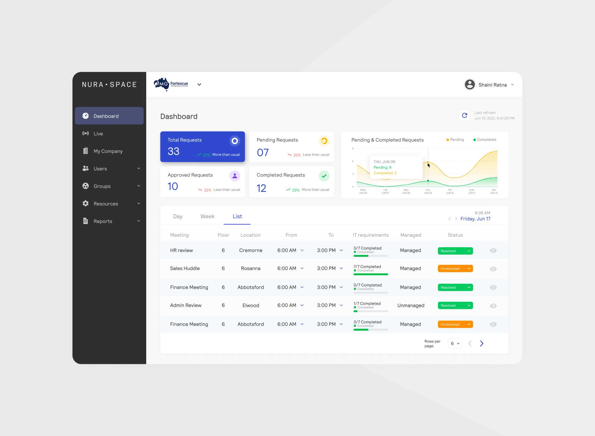
a more cohesive and consistent product experience, with a defined design system that improved usability and reduced design inconsistencies. the system created a stronger foundation for ongoing product development and made it easier to introduce new features without reworking existing patterns.
created a system that scales with the product. balancing structure and flexibility so the team can continue to evolve quickly without losing consistency or clarity.